Role
Senior Product Designer
Platform
Healthcare SaaS
Company
Magentus
Year
2020-2021
About the Product
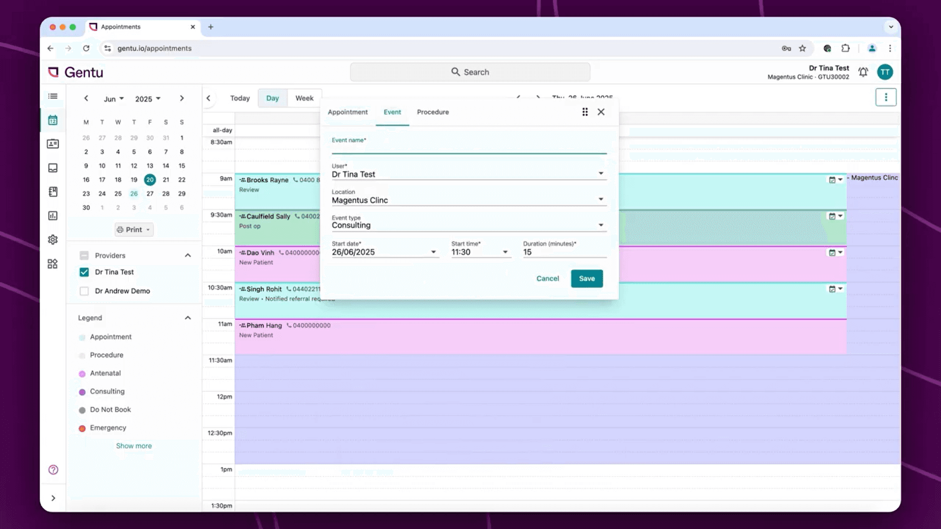
Gentu is a cloud-based practice management system for healthcare practices, supporting everyday workflows such as patient management, appointments, billing and clinical administration. It is designed to help practitioners and practice teams manage the operational side of patient care in one connected system.

The Challenge
The Appointment Book sits at the heart of a medical practice.
Administrators use it continuously throughout the day: creating patients, scheduling appointments, handling changes and keeping everything running smoothly.
Practitioners use it for something very different: understanding their schedule, reviewing patient information and preparing for upcoming consultations.
Over time, the experience had become increasingly difficult to navigate.
Common tasks required too much effort, important information was difficult to scan and appointment changes weren't always communicated effectively between administrators and practitioners.
The Appointment Book was trying to serve two users with very different needs.
Understanding the problem
A busy screen isn't necessarily an informative one
01 Too much effort
Everyday tasks such as creating patients, scheduling appointments and completing pre-appointment activities involved unnecessary steps.
02 Poor visibility
Administrators needed to understand what was happening across the practice quickly. But important information competed with everything else on screen, making busy schedules harder to scan and manage.
03 Information gaps
Appointment changes and cancellations affected both administrators and practitioners. The handover between them wasn't always clear, creating opportunities for information to be missed.
Understanding our users
Two users. One Appointment Book.
Research revealed an important distinction. Administrators and practitioners weren't simply two people using the same feature. They were using it to accomplish fundamentally different things.


The Appointment Book wasn't serving one user. It was supporting two very different workflows.
Research
Looking beyond the interface
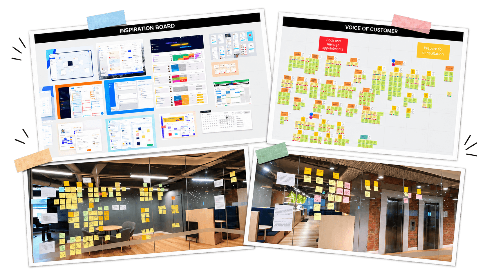
Before exploring solutions, we needed to understand how appointment management actually worked inside a practice. We combined desk research, SME interviews, workshops and user research to examine the workflow from different perspectives. Rather than looking only at individual screens, we looked at the sequence around an appointment, from creating a patient and booking through to preparation, changes and cancellations. Three patterns became clear.
Simple tasks were taking too much effort
High-frequency actions such as creating patients, scheduling appointments and completing pre-appointment checks required more interaction than users expected. Individually these were small frustrations. Repeated throughout the day, they became significant.
Complexity increased as practices grew
More practitioners meant more appointments, more information and more coordination. Administrators weren't simply scheduling appointments. They were managing an increasingly complex operational picture.
The admin–practitioner handover was fragile
Administrators often knew when something had changed. Practitioners needed to understand what that change meant for their day. Cancellations and appointment changes exposed weaknesses in how information moved between the two workflows.
Defining the opportunity
Three opportunities emerged: Rather than treating every usability issue separately, we grouped our findings into three design principles.

Simplify
Reduce the effort required for frequent tasks.
High-frequency actions should feel quick and predictable rather than requiring unnecessary steps.

Prioritise
Make important information easier to scan.
Not everything on the Appointment Book deserved equal visual weight. The interface needed to help users understand what required their attention.

Connect
Improve information flow between administrators and practitioners.
Changes made by one user should be clear to the other without relying on communication outside the system.
Designing the experience

With the foundations established, we began designing essential components and patterns in Figma. Rather than treating components as isolated UI elements, we considered how they would behave as part of a larger system. That meant thinking through variants, states, interaction behaviour, accessibility, naming conventions and how individual components combined into larger product patterns.
We also worked towards greater alignment between Figma and development. Establishing clearer terminology and component structures gave designers and developers a stronger shared language.
The goal wasn't to create the biggest possible component library. It was to create a system teams could understand, trust and reuse.
The biggest insight wasn't about scheduling
We started with what appeared to be an Appointment Book usability problem. But research revealed something more fundamental.
The same interface was being asked to support two different mental models.
Administrators needed to act & Practitioners needed to understand.
Recognising that distinction changed how we approached the experience. Sometimes simplifying a complex product isn't about removing functionality.
It's about understanding who needs what - and designing around that difference.
The outcome
An Appointment Book designed around how practices actually work